ADVERTISEMENT

Stephanie Dods on building a capsule wardrobe with hero pieces

At the SM Woman Styling Workshop, the lifestyle creator shared tips on working with neutrals, layering cleverly, and using the 60-30-10 color rule to elevate your look

Published Mar 18, 2026 09:40 am
You’ve probably come across her on Instagram—even if you don’t follow her yet. Her posts are filled with clean lines, effortless neutrals, and outfits that look polished without trying too hard.
Stephanie Dods
Stephanie Dods
For Stephanie Dods, fashion is about movement, rhythm, and intention. With her interior design background, she treats her wardrobe like a well-designed space: Every piece should feel balanced, purposeful, and uplifting. She shows how practical pieces can also be elegant, and how thoughtful styling can make everyday dressing simple yet expressive.
“Great style always starts with pieces that make getting dressed easy,” Stephanie says. “When you build a wardrobe around pieces that work beautifully together, you don’t overthink—you just feel confident.”
Last March 11, 2026, Stephanie hosted a SM Woman Styling Workshop at the Prestige Lounge in SM Makati. Open to SM Prestige members, shoppers were treated to a complimentary color analysis and hands-on guidance on building a functional wardrobe, identifying hero pieces, and creating versatile outfits tailored to their lifestyle.
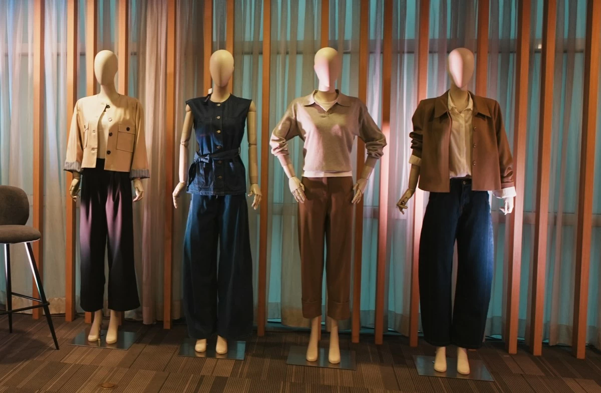
Building a capsule wardrobe
Stephanie emphasizes starting with timeless neutrals. “Some people say neutrals are boring, but they’re actually timeless and versatile,” she points out during the workshop. Her recommendations include well-cut blazers, soft knits, structured button-ups, and versatile pants in black, beige, and gray—pieces that serve as the backbone of any wardrobe. “These are your workhorse pieces,” she continued. “Pieces you’re going to wear over and over again.”
Layering is key. Stephanie teaches participants to think in three parts: a bottom, a top, and a layering piece, with an accent color making up the final 10 percent. This is the 60-30-10 color rule, borrowed from interior design: 60 percent of your outfit is a dominant color, 30 percent a secondary color, and 10 percent a pop or accent. The result is a cohesive, intentional, and visually appealing look.
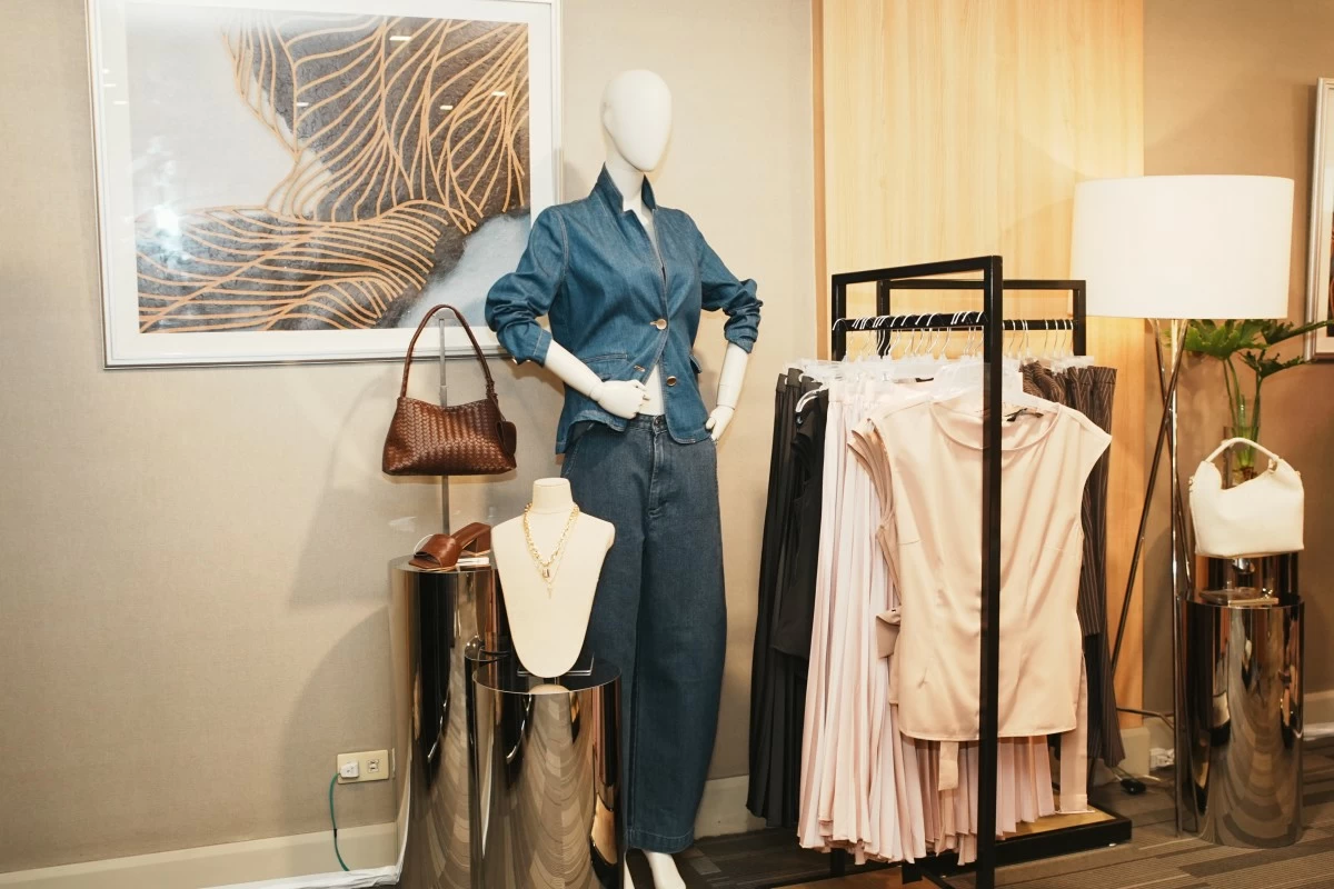
Hero pieces that transform
Fit and proportion matter as much as color. “When something fits really well, it automatically looks more expensive, more polished, more intentional,” Stephanie notes, sharing that The SM Store offers alterations to ensure pieces fit perfectly. Around 70 percent of the items she buys are tailored, guaranteeing they flatter her body and elevate her outfits. “You just need to focus on tailoring and knowing your proportions,” she adds.
Hero pieces, like a textured blazer, a structured jacket, or a sharply tailored coat, can instantly transform multiple outfits. “I personally wear a lot of pants, but if you wear skirts or shorts, tailor them to your needs,” she reminds. One white button-up or well-cut blazer can become five different looks—from casual daywear to layered work outfits or weekend chic.
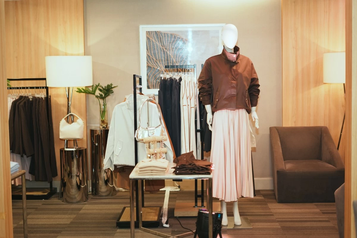
Styling in action
Stephanie demonstrated how a funnel jacket, one of the season’s trendiest pieces, could be worn three ways: with a jersey dress and heels for a polished look, sneakers for errands, or with a tank top and trousers for a transitional style. She paired a navy, silver-accented jacket with trousers and skirts, showing how one piece can elevate multiple outfits. “The 60-30-10 rule helps keep the look clean and cohesive,” she explains.
Her method encourages women to invest in staples that mix, match, and layer effortlessly. This intentional approach not only simplifies dressing but also boosts confidence. “A capsule wardrobe lets one piece become five different outfits—that’s real power,” Stephanie concludes.
With a capsule wardrobe and a few hero pieces, getting dressed each day becomes easy, intentional, and sets the tone for your day.

Related Tags

fashion and beauty SM Woman Stephanie Dods
ADVERTISEMENT
.most-popular .layout-ratio{ padding-bottom: 79.13%; } @media (min-width: 768px) and (max-width: 1024px) { .widget-title { font-size: 15px !important; } }

{{ articles_filter_1561_widget.title }}

.most-popular .layout-ratio{ padding-bottom: 79.13%; } @media (min-width: 768px) and (max-width: 1024px) { .widget-title { font-size: 15px !important; } }

{{ articles_filter_1562_widget.title }}

.most-popular .layout-ratio{ padding-bottom: 79.13%; } @media (min-width: 768px) and (max-width: 1024px) { .widget-title { font-size: 15px !important; } }

{{ articles_filter_1563_widget.title }}

{{ articles_filter_1564_widget.title }}

.mb-article-details { position: relative; } .mb-article-details .article-body-preview, .mb-article-details .article-body-summary{ font-size: 17px; line-height: 30px; font-family: "Libre Caslon Text", serif; color: #000; } .mb-article-details .article-body-preview iframe , .mb-article-details .article-body-summary iframe{ width: 100%; margin: auto; } .read-more-background { background: linear-gradient(180deg, color(display-p3 1.000 1.000 1.000 / 0) 13.75%, color(display-p3 1.000 1.000 1.000 / 0.8) 30.79%, color(display-p3 1.000 1.000 1.000) 72.5%); position: absolute; height: 200px; width: 100%; bottom: 0; display: flex; justify-content: center; align-items: center; padding: 0; } .read-more-background a{ color: #000; } .read-more-btn { padding: 17px 45px; font-family: Inter; font-weight: 700; font-size: 18px; line-height: 16px; text-align: center; vertical-align: middle; border: 1px solid black; background-color: white; } .hidden { display: none; }
function initializeAllSwipers() { // Get all hidden inputs with cms_article_id document.querySelectorAll('[id^="cms_article_id_"]').forEach(function (input) { const cmsArticleId = input.value; const articleSelector = '#article-' + cmsArticleId + ' .body_images'; const swiperElement = document.querySelector(articleSelector); if (swiperElement && !swiperElement.classList.contains('swiper-initialized')) { new Swiper(articleSelector, { loop: true, pagination: false, navigation: { nextEl: '#article-' + cmsArticleId + ' .swiper-button-next', prevEl: '#article-' + cmsArticleId + ' .swiper-button-prev', }, }); } }); } setTimeout(initializeAllSwipers, 3000); const intersectionObserver = new IntersectionObserver( (entries) => { entries.forEach((entry) => { if (entry.isIntersecting) { const newUrl = entry.target.getAttribute("data-url"); if (newUrl) { history.pushState(null, null, newUrl); let article = entry.target; // Extract metadata const author = article.querySelector('.author-section').textContent.replace('By', '').trim(); const section = article.querySelector('.section-info ').textContent.replace(' ', ' '); const title = article.querySelector('.article-title h1').textContent; // Parse URL for Chartbeat path format const parsedUrl = new URL(newUrl, window.location.origin); const cleanUrl = parsedUrl.host + parsedUrl.pathname; // Update Chartbeat configuration if (typeof window._sf_async_config !== 'undefined') { window._sf_async_config.path = cleanUrl; window._sf_async_config.sections = section; window._sf_async_config.authors = author; } // Track virtual page view with Chartbeat if (typeof pSUPERFLY !== 'undefined' && typeof pSUPERFLY.virtualPage === 'function') { try { pSUPERFLY.virtualPage({ path: cleanUrl, title: title, sections: section, authors: author }); } catch (error) { console.error('ping error', error); } } // Optional: Update document title if (title && title !== document.title) { document.title = title; } } } }); }, { threshold: 0.1 } ); function showArticleBody(button) { const article = button.closest("article"); const summary = article.querySelector(".article-body-summary"); const body = article.querySelector(".article-body-preview"); const readMoreSection = article.querySelector(".read-more-background"); // Hide summary and read-more section summary.style.display = "none"; readMoreSection.style.display = "none"; // Show the full article body body.classList.remove("hidden"); } document.addEventListener("DOMContentLoaded", () => { let loadCount = 0; // Track how many times articles are loaded const offset = [1, 2, 3, 4, 5, 6, 7, 8, 9, 10]; // Offset values const currentUrl = window.location.pathname.substring(1); let isLoading = false; // Prevent multiple calls if (!currentUrl) { console.log("Current URL is invalid."); return; } const sentinel = document.getElementById("load-more-sentinel"); if (!sentinel) { console.log("Sentinel element not found."); return; } function isSentinelVisible() { const rect = sentinel.getBoundingClientRect(); return ( rect.top < window.innerHeight && rect.bottom >= 0 ); } function onScroll() { if (isLoading) return; if (isSentinelVisible()) { if (loadCount >= offset.length) { console.log("Maximum load attempts reached."); window.removeEventListener("scroll", onScroll); return; } isLoading = true; const currentOffset = offset[loadCount]; window.loadMoreItems().then(() => { let article = document.querySelector('#widget_1690 > div:nth-last-of-type(2) article'); intersectionObserver.observe(article) loadCount++; }).catch(error => { console.error("Error loading more items:", error); }).finally(() => { isLoading = false; }); } } window.addEventListener("scroll", onScroll); });

Sign up by email to receive news.