ADVERTISEMENT
970x220
.navbar-nav.header-menu { width: 100%; justify-content: center; } .tab-menu-outers .nav-item{ width: unset; } .tab-bar-social.mt-5 { margin-top: 0 !important; } .second-header-menu { margin-top: 27px; padding: 12px 0; border-top: 1px solid #C3C1AE; border-bottom: 1px solid #C3C1AE; } .third-header-menu{ padding: 12px 0; } .bottom-header-menu { margin-right: 25px; text-decoration: none; font-family: "Canicule Display v0.3 Trial" , serif; font-weight: 500; font-size: 15px; line-height: 16px; color: black; } .bottom-header-menu:hover { color: #0A58CA !important; } header .time-date-section { display: flex; align-items: end; } header .mb-header-center .align-items-center .col-3 , header .mb-header-center .align-items-center .col-6, header .top-header-container .col-md-6{ z-index: 100; } header .desktop-menu-bar li:hover a{ background: transparent; color: #2E3192 !important; } @media(max-width: 767px) { header.header.mb-header{ display:none; } .second-header-menu .justify-content-center{ justify-content: start !important; } .second-header-menu ul , .third-header-menu ul{ display: grid; grid-template-columns: 1fr 1fr; width: 100%; } }

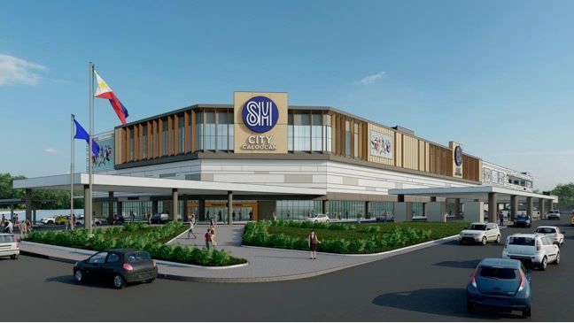
SM Prime to open third Caloocan mall

Published May 15, 2024 07:52 am

SM Prime Holdings Inc., one of the leading integrated property developers in Southeast Asia, is slated to open of SM City Caloocan on May 17, Friday. 

The firm said in a disclosure to the Philippine Stock Exchange, that this is its third mall in Caloocan City, and its first in the northern cluster of the city, providing more than 94,000 square meters of gross floor area.

SM City Caloocan, which is located along Deparo Road, Brgy. 171, Zone 15, District 1, Bagumbong, Caloocan City, follows the success of SM City Sangandaan and SM City Grand Central, which are both located in the south cluster of Caloocan City.

SM Prime Jeffrey Lim.jpeg
SM Prime President Mr. Jeffrey Lim


“With the opening of SM City Caloocan, we bring to the northern part of the city the same world- class shopping experience we offer in the southern part with our SM City Grand Central, opened just over two years ago,” SM Prime President Jeffrey Lim said. 

He added that, “We also hope to attract patrons from neighboring cities as we have more than 90,000 square meters of retail space curated to serve and cater the demands of highly urbanized residents of these communities.”

sm prime caloocan.jpg
Artist’s Rendition of SM City Caloocan

SM City Caloocan will have three levels of mixed-use commercial space sharing a colorful mix of dining, shopping, and entertainment spots on this side of the Metro.

It will open with more than 90 percent of space lease-awarded, housing sought-after SM brands namely The SM Store, SM Supermarket, Watsons, Miniso, Surplus, Ace Hardware, SM Appliance, Crocs, Uniqlo, and BDO. 

The mall will also have SM Food Court, SM Cinema consisting of three regular cinemas, Wellness Space, Cyberzone, three large-format in-door amusement, and air-conditioned Sky Plaza. 

For added convenience to its guests, the mall will have almost 1,200 parking slots, a public transport terminal, and an Electric Vehicle Charging Station (ECVS) at the third level, which aims to promote sustainable transportation development in the area.

SM Prime is scheduled to open four new malls this year, including SM City Caloocan, SM City J Mall in Mandaue, Cebu, SM City San Fernando La Union and SM City Laoag.
 

Related Tags

SM Prime Holdings Inc. Jeffrey C. Lim
ADVERTISEMENT
300x250
.most-popular .layout-ratio{ padding-bottom: 79.13%; } @media (min-width: 768px) and (max-width: 1024px) { .widget-title { font-size: 15px !important; } }

{{ articles_filter_1561_widget.title }}

.most-popular .layout-ratio{ padding-bottom: 79.13%; } @media (min-width: 768px) and (max-width: 1024px) { .widget-title { font-size: 15px !important; } }

{{ articles_filter_1562_widget.title }}

.most-popular .layout-ratio{ padding-bottom: 79.13%; } @media (min-width: 768px) and (max-width: 1024px) { .widget-title { font-size: 15px !important; } }

{{ articles_filter_1563_widget.title }}

{{ articles_filter_1564_widget.title }}

.mb-article-details { position: relative; } .mb-article-details .article-body-preview, .mb-article-details .article-body-summary{ font-size: 17px; line-height: 30px; font-family: "Libre Caslon Text", serif; color: #000; } .mb-article-details .article-body-preview iframe , .mb-article-details .article-body-summary iframe{ width: 100%; margin: auto; } .read-more-background { background: linear-gradient(180deg, color(display-p3 1.000 1.000 1.000 / 0) 13.75%, color(display-p3 1.000 1.000 1.000 / 0.8) 30.79%, color(display-p3 1.000 1.000 1.000) 72.5%); position: absolute; height: 200px; width: 100%; bottom: 0; display: flex; justify-content: center; align-items: center; padding: 0 72px 0 12px; } .read-more-background a{ color: #000; } .read-more-btn { padding: 17px 45px; font-family: Inter; font-weight: 700; font-size: 18px; line-height: 16px; text-align: center; vertical-align: middle; border: 1px solid black; background-color: white; } .hidden { display: none; }
function showArticleBody(button) { const article = button.closest("article"); const summary = article.querySelector(".article-body-summary"); const body = article.querySelector(".article-body-preview"); const readMoreSection = article.querySelector(".read-more-background"); // Hide summary and read-more section summary.style.display = "none"; readMoreSection.style.display = "none"; // Show the full article body body.classList.remove("hidden"); } document.addEventListener("DOMContentLoaded", () => { let loadCount = 0; // Track how many times articles are loaded const offset = [1, 2, 3, 4, 5, 6, 7, 8, 9, 10]; // The two offset values // changed to 10 from 1 , 2 const currentUrl = window.location.pathname.substring(1); let isLoading = false; // Prevent multiple calls if (!currentUrl) { console.log("Current URL is invalid."); return; } function isNearBottom() { return window.innerHeight + window.scrollY >= document.documentElement.scrollHeight - 100; } function onScroll() { if (isLoading) return; // Skip if already loading if (isNearBottom()) { if (loadCount >= offset.length) { console.log("Maximum load attempts reached."); window.removeEventListener("scroll", onScroll); return; } isLoading = true; // Set flag to prevent multiple calls const currentOffset = offset[loadCount]; window.loadMoreItems().then(() => { loadCount++; // Increment only after successful execution }).catch(error => { console.error("Error loading more items:", error); }).finally(() => { isLoading = false; // Reset flag after execution }); } } window.addEventListener("scroll", onScroll); }); // Mutation Observer for Newly Loaded Articles const observer = new MutationObserver(() => { const articles = document.querySelectorAll(".articles-observe"); if (articles.length > 0) { observeArticles(articles); } }); observer.observe(document.body, { childList: true, subtree: true }); // Intersection Observer for Updating URL function observeArticles(articles) { const intersectionObserver = new IntersectionObserver( (entries) => { entries.forEach((entry) => { if (entry.isIntersecting) { const newUrl = entry.target.getAttribute("data-url"); if (newUrl) { history.pushState(null, null, newUrl); } } }); }, { threshold: 0.1 } ); articles.forEach(article => intersectionObserver.observe(article)); }
.col-md-12.noPadding.col-xs-12:has(.mb-header-bottom) {padding: 0;} .bottom-footer {color: #fff;background-color: #2E3192;padding: 8px 0;} .bottom-footer .bottom-footer-menu {font-family: Inter;font-weight: 400;font-size: 12px;line-height: 16px;padding: 0px 10px !important;color: #fff !important;text-decoration: none; } .bottom-footer .container {display: flex;justify-content: space-between;align-items: center; } .bottom-footer p{font-family: "Inter";font-weight: 400;font-size: 12px;line-height: 16px;margin-bottom: 0;} .subscribe-button{position: absolute;bottom: 15%;right: 11%;} .subscribe-container {position: fixed;display: flex;align-items: center;background-color: white;height: 50px;border-radius: 50px;box-shadow: 1px 3px 8px 3px rgba(0, 0, 0, 0.2);width: 50px;overflow: hidden;transition: width 0.3s ease-in-out;text-decoration: none;white-space: nowrap; } .subscribe-icon {background-color: #2E3192;color: white;border-radius: 50%;width: 50px;height: 50px;display: flex;align-items: center;justify-content: center;font-size: 18px;flex-shrink: 0;transition: border-radius 0.3s ease-in-out; } .subscribe-text {font-size: 18px;font-weight: bold;color: black;margin-left: 0;margin-right: 0;width: 0;visibility: hidden;opacity: 0;transition: opacity 0.3s ease, width 0.3s ease;} .subscribe-container:hover {cursor: pointer;width: 170px;} .subscribe-container:hover .subscribe-icon {border-bottom-right-radius: 0;border-top-right-radius: 0;} .subscribe-container:hover .subscribe-text {visibility: visible;opacity: 1;margin-left: 10px;margin-right: 10px;width: auto;} h6.footer-heading{ font-weight: 700; } #bottom-footer ul li { display: flex; align-items: center; } @media screen and (min-width: 767px) and (max-width: 991px) { .bottom-footer p, .bottom-footer .bottom-footer-menu{ font-size: 9px; } } @media(max-width: 767px) { .bottom-footer .container {display: block;} .bottom-footer .container .justify-content-center{margin-top: 20px !important;} .bottom-footer .container .justify-content-center .list-group{ width: 100%; display: grid; row-gap: 10px; grid-template-columns: 1fr 1fr 1fr; justify-content: unset; } .bottom-footer p{font-size: 10px;} .subscribe-container { width: 50px !important; overflow: hidden;} .subscribe-container:hover { width: 50px !important;} .subscribe-container .subscribe-text {display: none !important;} .subscribe-button{right: 15%;bottom:7%;} } .mb-header-bottom .header-menu:hover { color: #2E3192 !important; } @media(max-width: 400px) { .bottom-footer .container .justify-content-center .list-group{ grid-template-columns: 1fr 1fr; } }

Sign up by email to receive news.