ADVERTISEMENT
970x220
.navbar-nav.header-menu { width: 100%; justify-content: center; } .tab-menu-outers .nav-item{ width: unset; } .tab-bar-social.mt-5 { margin-top: 0 !important; } .second-header-menu { margin-top: 27px; padding: 12px 0; border-top: 1px solid #C3C1AE; border-bottom: 1px solid #C3C1AE; } .third-header-menu{ padding: 12px 0; } .bottom-header-menu { margin-right: 25px; text-decoration: none; font-family: "Canicule Display v0.3 Trial" , serif; font-weight: 500; font-size: 15px; line-height: 16px; color: black; } .bottom-header-menu:hover { color: #0A58CA !important; } header .time-date-section { display: flex; align-items: end; } header .mb-header-center .align-items-center .col-3 , header .mb-header-center .align-items-center .col-6, header .top-header-container .col-md-6{ z-index: 100; } header .desktop-menu-bar li:hover a{ background: transparent; color: #2E3192 !important; } @media(max-width: 767px) { header.header.mb-header{ display:none; } .second-header-menu .justify-content-center{ justify-content: start !important; } .second-header-menu ul , .third-header-menu ul{ display: grid; grid-template-columns: 1fr 1fr; width: 100%; } }

London Fashion Week: Mark Fast’s future is bright and edgy

Featuring urban city architecture Intertwined with space-inspired allure

Published Feb 18, 2024 07:52 am  |  Updated Feb 18, 2024 07:52 am
IMG_1066.jpeg
(Photos by Can Levent)

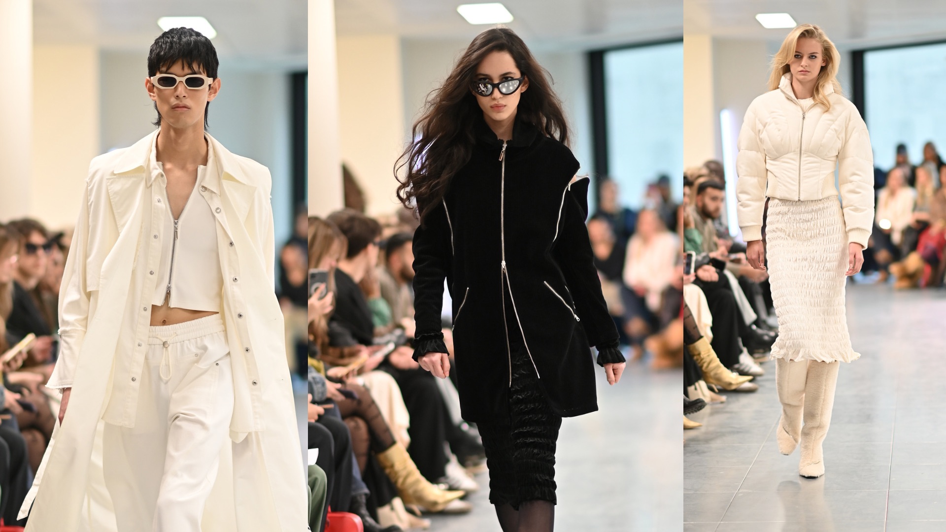
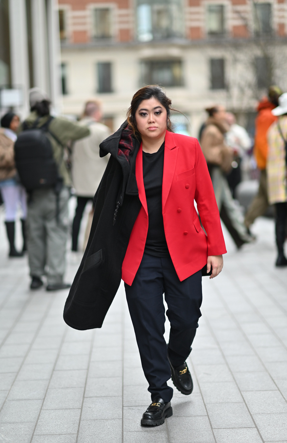
The much-anticipated London Fashion Week commenced with a dazzling display as Mark Fast's “Galaxy Beyond” collection took the spotlight at The Broadway. Fast's distinctive vision seamlessly intertwined elements of urban city architecture inspired by architect Joe Colombo with space-inspired allure, gothic motifs, and opulent comfort, resulting in a captivating and commanding presence within the urban landscape.

IMG_1063.jpeg
(Photos by Can Levent)

The collection blended futuristic elements with edgy, urban-inspired designs, creating a visually captivating and avant-garde aesthetic. Models strutted down the runway in sleek, form-fitting garments adorned with metallic embellishments, reminiscent of celestial bodies and the vast expanse of outer space. The use of shimmering fabrics and iridescent textures added a sense of otherworldly allure, transporting the audience to a realm beyond the confines of Earth. 

IMG_1065.jpeg
(Photos by Can Levent)

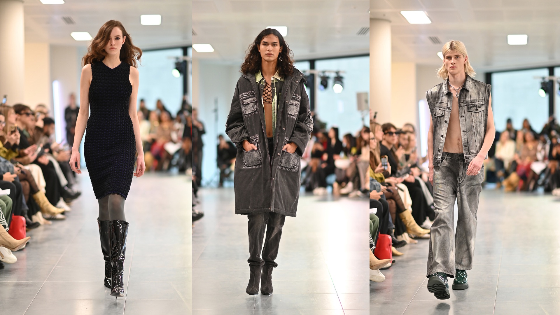
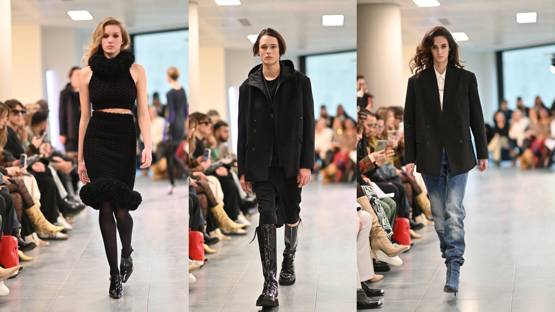
The designer’s masterful use of architectural silhouettes and precision tailoring was evident throughout the collection, showcasing structured coats, sharp lines, and asymmetrical hemlines that exuded a powerful and confident aura. The juxtaposition of soft, luxurious fabrics with bold, industrial-inspired details created a captivating contrast that embodied the intersection of modernity and timeless elegance.

IMG_1064.jpeg
(Photos by Can Levent)

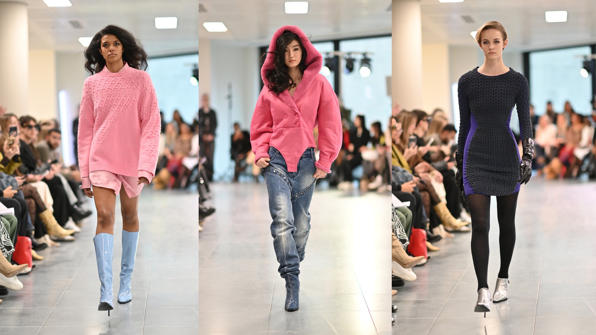
In the same light, the latest collection boldly reaffirmed the designer’s signature brand of knit designs while simultaneously pushing the boundaries with the incorporation of oversized coats and weather-resistant materials. The seamless fusion of these elements not only embodied his edgy aesthetic but also introduces a practical dimension to his creations.

IMG_1068.jpeg
The author at the Mark Fast show (Photo by Can Levent)

Overall, “Galaxy Beyond” by Mark Fast at The Broadway was a mesmerizing journey into a fashion-forward, otherworldly realm. This groundbreaking show undoubtedly set the tone for an exhilarating and boundary-pushing London Fashion Week.

Related Tags

Mark Fast Joe Colombo The Broadway London London Fashion Week Can Levent
ADVERTISEMENT
300x250
.most-popular .layout-ratio{ padding-bottom: 79.13%; } @media (min-width: 768px) and (max-width: 1024px) { .widget-title { font-size: 15px !important; } }

{{ articles_filter_1561_widget.title }}

.most-popular .layout-ratio{ padding-bottom: 79.13%; } @media (min-width: 768px) and (max-width: 1024px) { .widget-title { font-size: 15px !important; } }

{{ articles_filter_1562_widget.title }}

.most-popular .layout-ratio{ padding-bottom: 79.13%; } @media (min-width: 768px) and (max-width: 1024px) { .widget-title { font-size: 15px !important; } }

{{ articles_filter_1563_widget.title }}

{{ articles_filter_1564_widget.title }}

.mb-article-details { position: relative; } .mb-article-details .article-body-preview, .mb-article-details .article-body-summary{ font-size: 17px; line-height: 30px; font-family: "Libre Caslon Text", serif; color: #000; } .mb-article-details .article-body-preview iframe , .mb-article-details .article-body-summary iframe{ width: 100%; margin: auto; } .read-more-background { background: linear-gradient(180deg, color(display-p3 1.000 1.000 1.000 / 0) 13.75%, color(display-p3 1.000 1.000 1.000 / 0.8) 30.79%, color(display-p3 1.000 1.000 1.000) 72.5%); position: absolute; height: 200px; width: 100%; bottom: 0; display: flex; justify-content: center; align-items: center; padding: 0 72px 0 12px; } .read-more-background a{ color: #000; } .read-more-btn { padding: 17px 45px; font-family: Inter; font-weight: 700; font-size: 18px; line-height: 16px; text-align: center; vertical-align: middle; border: 1px solid black; background-color: white; } .hidden { display: none; }
function showArticleBody(button) { const article = button.closest("article"); const summary = article.querySelector(".article-body-summary"); const body = article.querySelector(".article-body-preview"); const readMoreSection = article.querySelector(".read-more-background"); // Hide summary and read-more section summary.style.display = "none"; readMoreSection.style.display = "none"; // Show the full article body body.classList.remove("hidden"); } document.addEventListener("DOMContentLoaded", () => { let loadCount = 0; // Track how many times articles are loaded const offset = [1, 2, 3, 4, 5, 6, 7, 8, 9, 10]; // The two offset values // changed to 10 from 1 , 2 const currentUrl = window.location.pathname.substring(1); let isLoading = false; // Prevent multiple calls if (!currentUrl) { console.log("Current URL is invalid."); return; } function isNearBottom() { return window.innerHeight + window.scrollY >= document.documentElement.scrollHeight - 100; } function onScroll() { if (isLoading) return; // Skip if already loading if (isNearBottom()) { if (loadCount >= offset.length) { console.log("Maximum load attempts reached."); window.removeEventListener("scroll", onScroll); return; } isLoading = true; // Set flag to prevent multiple calls const currentOffset = offset[loadCount]; window.loadMoreItems().then(() => { loadCount++; // Increment only after successful execution }).catch(error => { console.error("Error loading more items:", error); }).finally(() => { isLoading = false; // Reset flag after execution }); } } window.addEventListener("scroll", onScroll); }); // Mutation Observer for Newly Loaded Articles const observer = new MutationObserver(() => { const articles = document.querySelectorAll(".articles-observe"); if (articles.length > 0) { observeArticles(articles); } }); observer.observe(document.body, { childList: true, subtree: true }); // Intersection Observer for Updating URL function observeArticles(articles) { const intersectionObserver = new IntersectionObserver( (entries) => { entries.forEach((entry) => { if (entry.isIntersecting) { const newUrl = entry.target.getAttribute("data-url"); if (newUrl) { history.pushState(null, null, newUrl); } } }); }, { threshold: 0.1 } ); articles.forEach(article => intersectionObserver.observe(article)); }
.col-md-12.noPadding.col-xs-12:has(.mb-header-bottom) {padding: 0;} .bottom-footer {color: #fff;background-color: #2E3192;padding: 8px 0;} .bottom-footer .bottom-footer-menu {font-family: Inter;font-weight: 400;font-size: 12px;line-height: 16px;padding: 0px 10px !important;color: #fff !important;text-decoration: none; } .bottom-footer .container {display: flex;justify-content: space-between;align-items: center; } .bottom-footer p{font-family: "Inter";font-weight: 400;font-size: 12px;line-height: 16px;margin-bottom: 0;} .subscribe-button{position: absolute;bottom: 15%;right: 11%;} .subscribe-container {position: fixed;display: flex;align-items: center;background-color: white;height: 50px;border-radius: 50px;box-shadow: 1px 3px 8px 3px rgba(0, 0, 0, 0.2);width: 50px;overflow: hidden;transition: width 0.3s ease-in-out;text-decoration: none;white-space: nowrap; } .subscribe-icon {background-color: #2E3192;color: white;border-radius: 50%;width: 50px;height: 50px;display: flex;align-items: center;justify-content: center;font-size: 18px;flex-shrink: 0;transition: border-radius 0.3s ease-in-out; } .subscribe-text {font-size: 18px;font-weight: bold;color: black;margin-left: 0;margin-right: 0;width: 0;visibility: hidden;opacity: 0;transition: opacity 0.3s ease, width 0.3s ease;} .subscribe-container:hover {cursor: pointer;width: 170px;} .subscribe-container:hover .subscribe-icon {border-bottom-right-radius: 0;border-top-right-radius: 0;} .subscribe-container:hover .subscribe-text {visibility: visible;opacity: 1;margin-left: 10px;margin-right: 10px;width: auto;} h6.footer-heading{ font-weight: 700; } #bottom-footer ul li { display: flex; align-items: center; } @media screen and (min-width: 767px) and (max-width: 991px) { .bottom-footer p, .bottom-footer .bottom-footer-menu{ font-size: 9px; } } @media(max-width: 767px) { .bottom-footer .container {display: block;} .bottom-footer .container .justify-content-center{margin-top: 20px !important;} .bottom-footer .container .justify-content-center .list-group{ width: 100%; display: grid; row-gap: 10px; grid-template-columns: 1fr 1fr 1fr; justify-content: unset; } .bottom-footer p{font-size: 10px;} .subscribe-container { width: 50px !important; overflow: hidden;} .subscribe-container:hover { width: 50px !important;} .subscribe-container .subscribe-text {display: none !important;} .subscribe-button{right: 15%;bottom:7%;} } .mb-header-bottom .header-menu:hover { color: #2E3192 !important; } @media(max-width: 400px) { .bottom-footer .container .justify-content-center .list-group{ grid-template-columns: 1fr 1fr; } }

Sign up by email to receive news.