


Manila Bulletin
 Entertainment
Celebrities
Bea Alonzo, Dominic Roque confirm breakup: It was not an easy decision
Entertainment
Celebrities
Bea Alonzo, Dominic Roque confirm breakup: It was not an easy decision
Entertainment
Celebrities
Bea Alonzo, Dominic Roque confirm breakup: It was not an easy decision
Bea Alonzo, Dominic Roque confirm breakup: It was not an easy decision
Published Feb 11, 2024 10:23 am


At A Glance
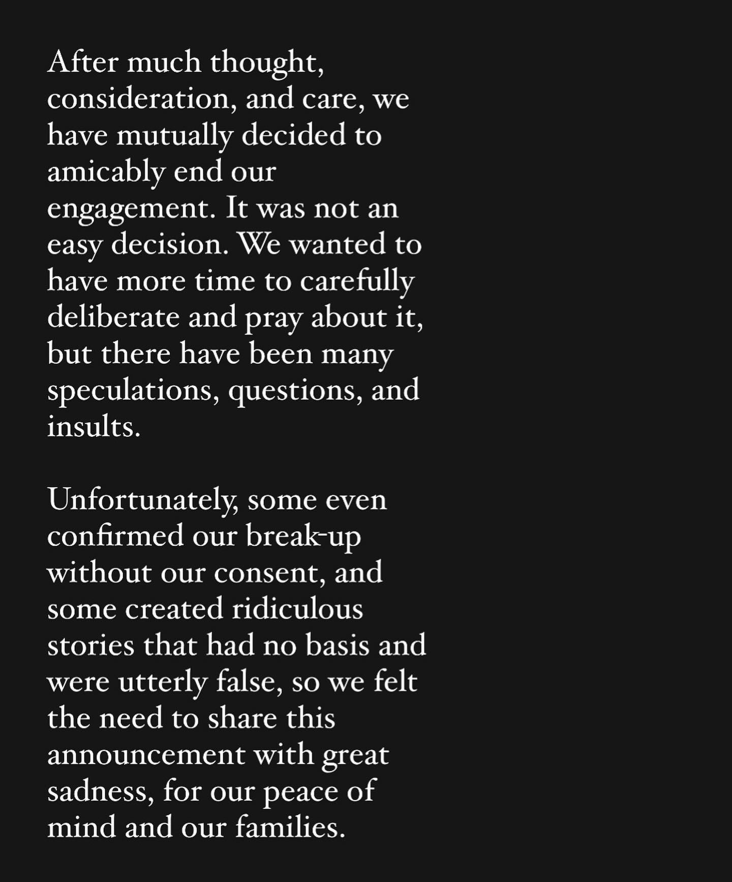
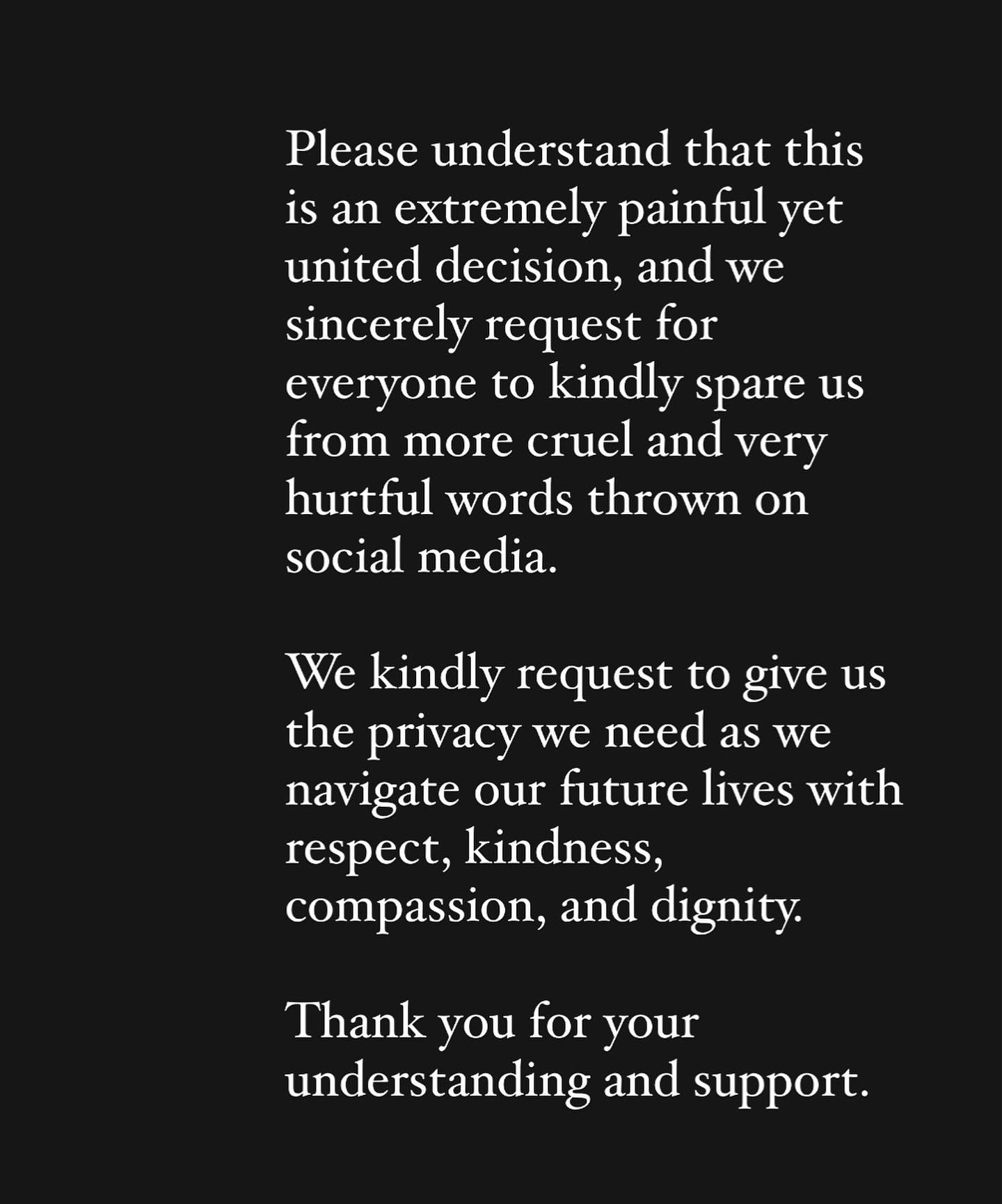
- In a joint statement issued on Feb. 11, Bea and Dominic also slammed the ridiculous stories related to their breakup that had no basis and were utterly false.
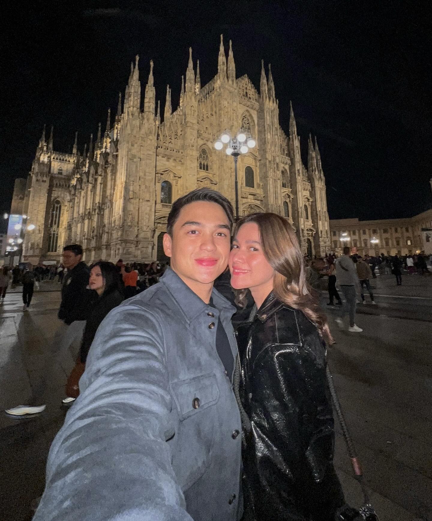
Bea Alonzo and Dominic Roque announced that they have mutually decided to amicably end their engagement.
In a joint statement issued on Feb. 11, Bea and Dominic also slammed the ridiculous stories related to their breakup that had no basis and were utterly false. The full statement:
Bea and Dominic became engaged in July and were expected to marry in 2024, but decided to call it off.