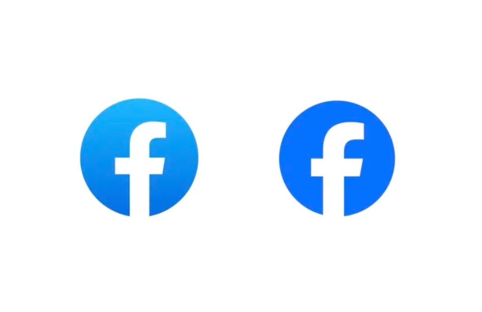
Did you notice? Facebook has a new logo with enhanced blue
Launch of 'Facebook Sans' and revamped blue aims to revitalize user experience and improve accessibility
At A Glance
- Facebook has unveiled a new logo utilizing a custom typeface, "Facebook Sans," aiming to enhance cohesiveness and legibility. The logo represents a step towards creating a sense of forward movement and is a pivotal part of Facebook's brand refresh.
- Facebook has introduced a new shade of blue, with the hex code #316FF6, as its primary brand color. The color palette also includes secondary blues, maintaining Facebook's iconic association with the color while increasing accessibility.
- The brand refresh undertaken by Facebook seeks to achieve three key goals: to revitalize the platform by redesigning iconic elements, to unify the brand for seamless product-to-marketing experiences, and to anchor the brand color palette around the newly introduced core blue, optimizing it for accessibility.
- The changes, including the new logo and color palette, officially rolled out on Thursday, September 20, 2023. However, this is just the first phase of the brand refresh, with more updates and modifications expected to be introduced in the future.
- Dave Nguyen, the Design Director at Meta, stated that Facebook is focusing on creating people-first experiences to help users progress on things that matter most to them. The overhaul is seen as a step forward in aligning the platform's design elements with the evolving needs and preferences of its global user base.
Facebook, the world's largest social media platform, has announced a brand refresh with a new logo and a new shade of blue as its primary color. The changes took effect on Thursday, September 20, 2023.

The new logo uses a custom typeface called Facebook Sans, which is also used across the platform. The logo design aims to improve cohesiveness and legibility and create a sense of forward movement.
The new color palette features a core blue with hex code #316FF6, now Facebook's primary brand color. The palette also includes secondary blues designed to increase accessibility and maintain the association between Facebook and the color blue.
According to Dave Nguyen, Design Director at Meta, the parent company of Facebook, the brand refresh was motivated by three goals: to refresh the platform by redesigning iconic elements, to unify the brand for product-to-marketing experiences, and to anchor the brand color palette around the core blue while optimizing for accessibility.
Nguyen also said that this is only the first phase of the brand refresh and that more updates will follow in the future. He added that Facebook focuses on creating people-first experiences that help others progress on the things that matter most to them.