


SM Prime highlights support for wetland conservation
Symposium also cites importance of nature-based architecture


As the world celebrated the International Day for Biological Diversity 2023 early this year, SM Prime Holdings Inc. (SM Prime) joined the Society for the Conservation of Philippine Wetlands, Inc. (SCPW) in hosting the fourth SCPW Wetland Center Design Symposium at the MAAX Building in the Mall of Asia Complex.
With the theme "Build Back Biodiversity: Wetland Centers and Nature-Based Architecture,” the hybrid symposium featured presentations centered on fostering knowledge and awareness about wetland conservation and innovative design approaches.
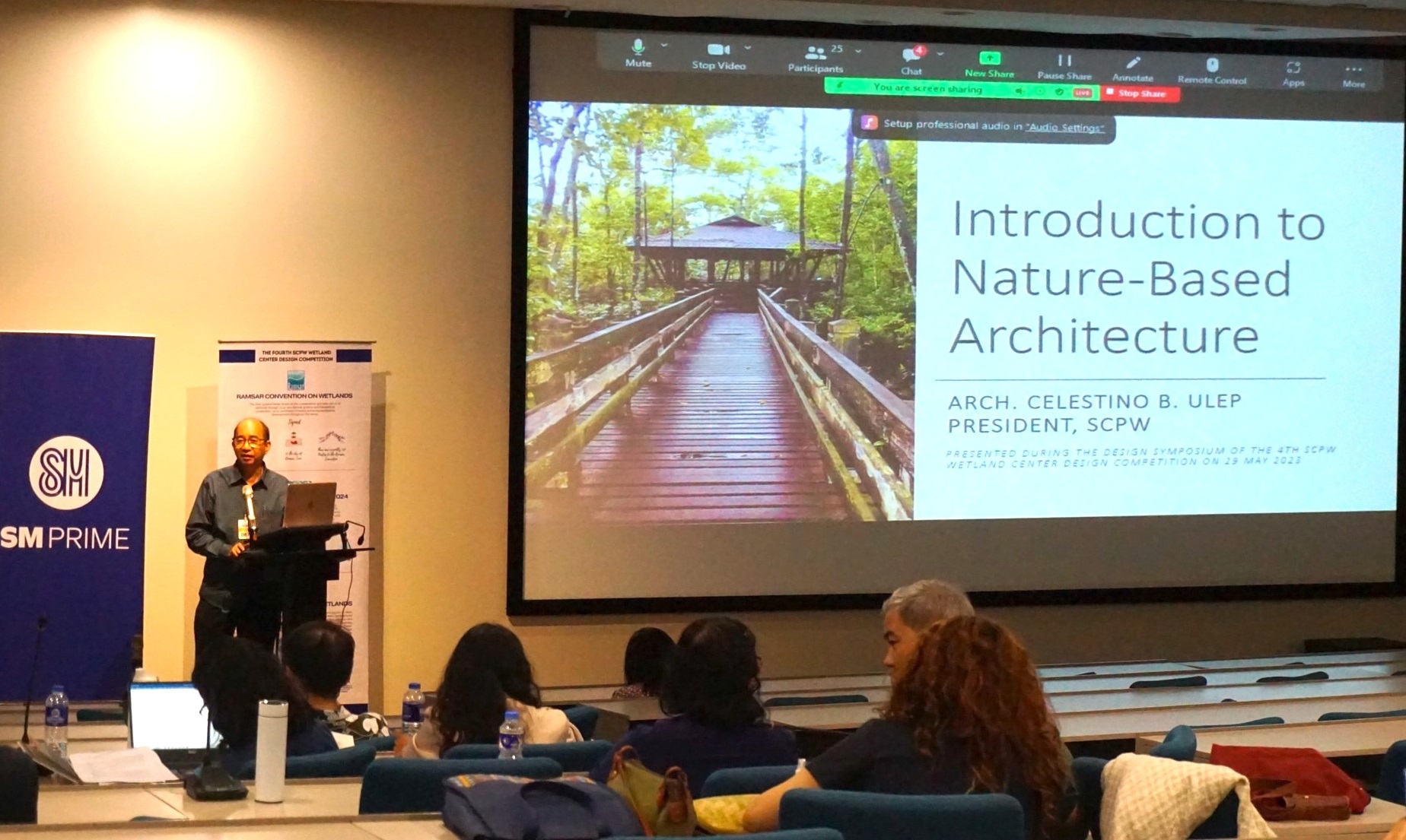 SCPW president Arch. Celestino Ulep discusses nature-based architecture during the fourth SCPW Wetland Center Design Symposium. (Photo from SCPW)
SCPW president Arch. Celestino Ulep opened the symposium by sharing his optimism on how collaboration and embracing nature-based architecture can pave the way toward creating a future where wetlands thrive and biodiversity flourishes.
Notable experts in the field also graced the event, sharing their insights and experiences including Chris Rostron, the global manager of Wetland Link International, and Alex Hughes of Wildfowl & Wetlands Trust in London, UK.
The guest speakers kicked off the discussion by sharing the pivotal role of wetland centers as a tool for communication, capacity building, education, participation, and awareness (CEPA) in wetland conservation efforts.
Ulep engaged the audience by introducing the concept of nature-based architecture, highlighting the importance of prioritizing sustainability and harmony in design by creating structures that seamlessly integrate with the natural environment.
Meanwhile, Arch. Aaron Lecciones, SCPW special projects officer, made a visual presentation on the Las Piñas-Parañaque Wetland Park (LPPWP) design team's experience. He highlighted the challenges and triumphs of designing a wetland park, serving as a source of inspiration for aspiring designers and architects.
Partners, including Rida Reyes Castillo of SM Prime, Dr. Arvin Diesmos of the ASEAN Centre for Biodiversity, Laudemir Salac of DENR-Region 3, and Arch. Gleo Raymundo of UAPSA graced the event to show their support for this endeavor.
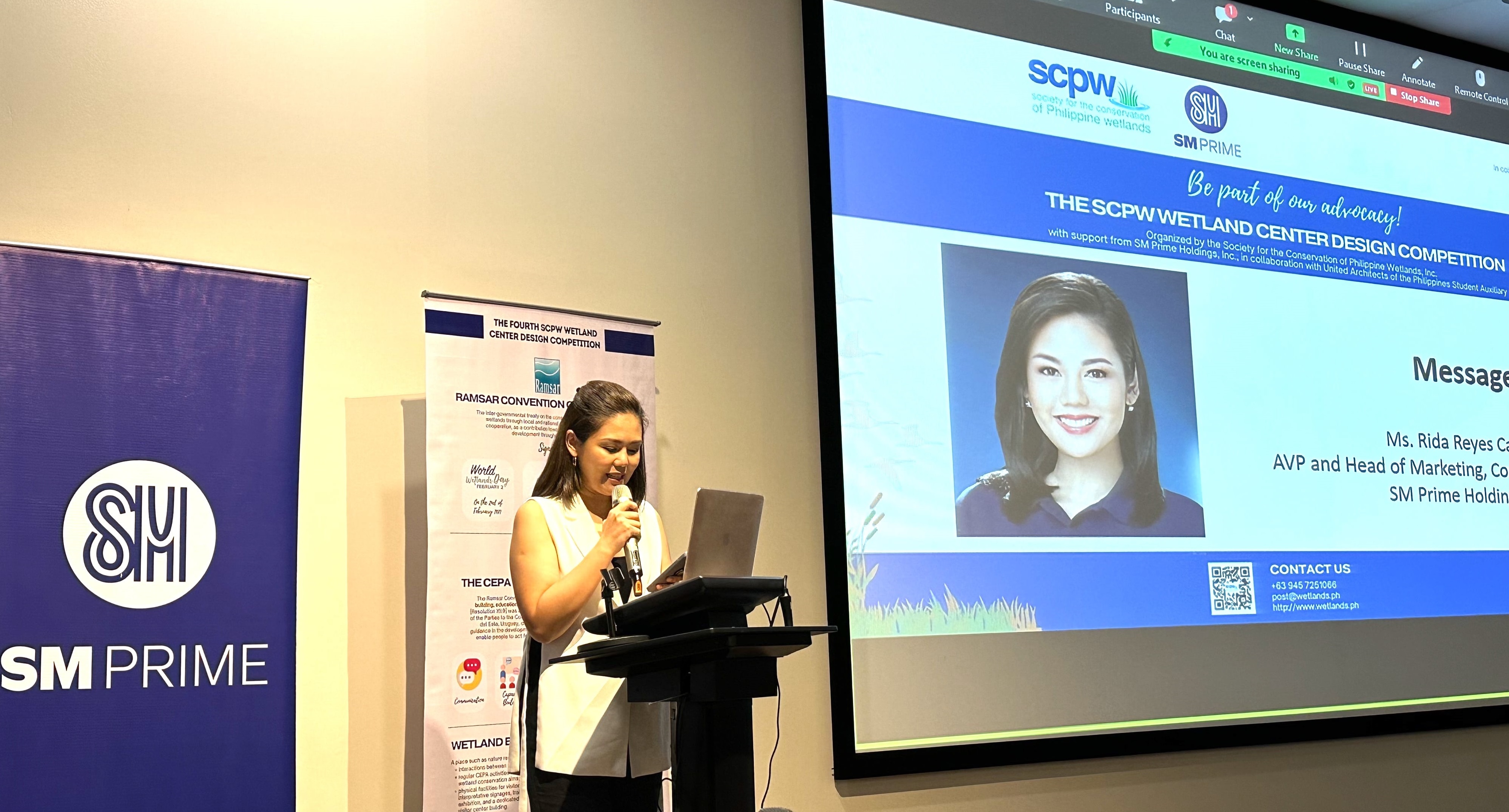 SM Prime AVP and head of marketing, PR, and communications Rida Reyes Castillo
"It is an honor and privilege on the part of SM to partner with the SCPW and UAPSA in realizing its common goal of protecting ecosystems, particularly wetlands, by inspiring the youth to engage and take action on the socio-civic and economic issues in their communities by finding workable solutions toward building a sustainable future," said SM Prime AVP and head of marketing, PR, and communications Rida Reyes Castillo.
Castillo further emphasized that environmental protection and nature conservation are integral pillars of SM Prime's sustainability campaign, and they believe in the power of cultivating the younger generation’s devotion to building a sustainable future.
The symposium concluded with a discussion on the rules and guidelines of a design competition, followed by an open forum and exchange of ideas among participants. It also marked the beginning of the 4th SCPW Wetland Center Design Competition, which aims to create a platform for talented students in the field of construction and design to showcase their skills and ingenuity, and encourages them to address environmental challenges through sustainable solutions.