ADVERTISEMENT
970x220
.navbar-nav.header-menu { width: 100%; justify-content: center; } .tab-menu-outers .nav-item{ width: unset; } .tab-bar-social.mt-5 { margin-top: 0 !important; } .second-header-menu { margin-top: 27px; padding: 12px 0; border-top: 1px solid #C3C1AE; border-bottom: 1px solid #C3C1AE; } .third-header-menu{ padding: 12px 0; } .bottom-header-menu { margin-right: 25px; text-decoration: none; font-family: "Canicule Display v0.3 Trial" , serif; font-weight: 500; font-size: 15px; line-height: 16px; color: black; } .bottom-header-menu:hover { color: #0A58CA !important; } header .time-date-section { display: flex; align-items: end; } header .mb-header-center .align-items-center .col-3 , header .mb-header-center .align-items-center .col-6, header .top-header-container .col-md-6{ z-index: 100; } header .desktop-menu-bar li:hover a{ background: transparent; color: #2E3192 !important; } @media(max-width: 767px) { header.header.mb-header{ display:none; } .second-header-menu .justify-content-center{ justify-content: start !important; } .second-header-menu ul , .third-header-menu ul{ display: grid; grid-template-columns: 1fr 1fr; width: 100%; } }

HYBE, Pledis Entertainment reveal name of new boy band debuting after Seventeen

Published Dec 20, 2023 23:07 pm  |  Updated Dec 20, 2023 23:07 pm

Korean agencies HYBE and Pledis Entertainment have unveiled the name of their upcoming K-pop boy band that will debut in January. 

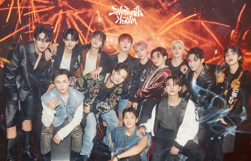
The name of the new boy band will be TWS (pronounced as Two-Us) that will be the first boy group to debut under Pledis Entertainment since record-breaking act Seventeen released their first album under the label nine years ago. 

231221_TWS_LOGO MOTION1.jpg

231221_TWS_LOGO MOTION2.jpg

TWS will debut in January (Pledis Entertainment)

HYBE is the parent company of Pledis Entertainment and has many subsidiaries including Big Hit Music. 

The logo motion video for TWS was uploaded on the band’s newly launched official social media channels at midnight KST on Dec. 21, providing the initial look into the boy band. 

Graphics of the text “TWS” and “24/7 WITH US” appear on screen in the video, incorporating both the alphabetical and numerical representation of the band's name and its meaning. 

TWS is an abbreviation of the expression “Twenty Four Seven With Us,” symbolizing the band's commitment to being with their fans around the clock. 

True to its name, the upcoming boy band aspires to impart bright, feel-good energy as “friends” that listeners would always want to be around. Their music will also revolve around uplifting and refreshing melodies.

TWS captured the attention of K-pop fans as “the rookie of 2024” early on, since their debut was first announced during the HYBE IR conference call in November. 

Pledis Entertainment brings in its wealth of expertise and creativity in K-pop, combining forces with HYBE's extensive and global infrastructure to offer comprehensive support for TWS' global debut.

"TWS will be the new ‘artist to watch,’ embodying an intricate balance of Pledis Entertainment’s outstanding creative capacity and HYBE’s robust infrastructure,” said Pledis Entertainment. 

It added, “Each member of the group will showcase their talent as a powerful artist and a performer, as well as musical flair that reflects their true colors. Their debut album, produced by our Master Professional Sung Soo Han, will be a masterful demonstration of Pledis Entertainment’s legacy in K-pop."

Seventeen4.jpeg

TWS will make their debut after Pledis Entertainment introduced Seventeen nine years ago (X) 

Additional content about the group will continue to be released on TWS’ official social media channels, leading up to their debut in January.

Artists under Pledis Entertainment include Nana, Bumzu, Baekho (Kang Dong Ho), Hwang Min Hyun, Seventeen, Fromis_9, Yehana and Sungyeon.

TWS’ social media channels: YouTube, X(Twitter), Instagram, TikTok, Facebook

Related Tags

Pledis Entertainment TWS Seventeen
ADVERTISEMENT
300x250
.most-popular .layout-ratio{ padding-bottom: 79.13%; } @media (min-width: 768px) and (max-width: 1024px) { .widget-title { font-size: 15px !important; } }

{{ articles_filter_1561_widget.title }}

.most-popular .layout-ratio{ padding-bottom: 79.13%; } @media (min-width: 768px) and (max-width: 1024px) { .widget-title { font-size: 15px !important; } }

{{ articles_filter_1562_widget.title }}

.most-popular .layout-ratio{ padding-bottom: 79.13%; } @media (min-width: 768px) and (max-width: 1024px) { .widget-title { font-size: 15px !important; } }

{{ articles_filter_1563_widget.title }}

{{ articles_filter_1564_widget.title }}

.mb-article-details { position: relative; } .mb-article-details .article-body-preview, .mb-article-details .article-body-summary{ font-size: 17px; line-height: 30px; font-family: "Libre Caslon Text", serif; color: #000; } .mb-article-details .article-body-preview iframe , .mb-article-details .article-body-summary iframe{ width: 100%; margin: auto; } .read-more-background { background: linear-gradient(180deg, color(display-p3 1.000 1.000 1.000 / 0) 13.75%, color(display-p3 1.000 1.000 1.000 / 0.8) 30.79%, color(display-p3 1.000 1.000 1.000) 72.5%); position: absolute; height: 200px; width: 100%; bottom: 0; display: flex; justify-content: center; align-items: center; padding: 0 72px 0 12px; } .read-more-background a{ color: #000; } .read-more-btn { padding: 17px 45px; font-family: Inter; font-weight: 700; font-size: 18px; line-height: 16px; text-align: center; vertical-align: middle; border: 1px solid black; background-color: white; } .hidden { display: none; }
function showArticleBody(button) { const article = button.closest("article"); const summary = article.querySelector(".article-body-summary"); const body = article.querySelector(".article-body-preview"); const readMoreSection = article.querySelector(".read-more-background"); // Hide summary and read-more section summary.style.display = "none"; readMoreSection.style.display = "none"; // Show the full article body body.classList.remove("hidden"); } document.addEventListener("DOMContentLoaded", () => { let loadCount = 0; // Track how many times articles are loaded const offset = [1, 2, 3, 4, 5, 6, 7, 8, 9, 10]; // The two offset values // changed to 10 from 1 , 2 const currentUrl = window.location.pathname.substring(1); let isLoading = false; // Prevent multiple calls if (!currentUrl) { console.log("Current URL is invalid."); return; } function isNearBottom() { return window.innerHeight + window.scrollY >= document.documentElement.scrollHeight - 100; } function onScroll() { if (isLoading) return; // Skip if already loading if (isNearBottom()) { if (loadCount >= offset.length) { console.log("Maximum load attempts reached."); window.removeEventListener("scroll", onScroll); return; } isLoading = true; // Set flag to prevent multiple calls const currentOffset = offset[loadCount]; window.loadMoreItems().then(() => { loadCount++; // Increment only after successful execution }).catch(error => { console.error("Error loading more items:", error); }).finally(() => { isLoading = false; // Reset flag after execution }); } } window.addEventListener("scroll", onScroll); }); // Mutation Observer for Newly Loaded Articles const observer = new MutationObserver(() => { const articles = document.querySelectorAll(".articles-observe"); if (articles.length > 0) { observeArticles(articles); } }); observer.observe(document.body, { childList: true, subtree: true }); // Intersection Observer for Updating URL function observeArticles(articles) { const intersectionObserver = new IntersectionObserver( (entries) => { entries.forEach((entry) => { if (entry.isIntersecting) { const newUrl = entry.target.getAttribute("data-url"); if (newUrl) { history.pushState(null, null, newUrl); } } }); }, { threshold: 0.1 } ); articles.forEach(article => intersectionObserver.observe(article)); }
.col-md-12.noPadding.col-xs-12:has(.mb-header-bottom) {padding: 0;} .bottom-footer {color: #fff;background-color: #2E3192;padding: 8px 0;} .bottom-footer .bottom-footer-menu {font-family: Inter;font-weight: 400;font-size: 12px;line-height: 16px;padding: 0px 10px !important;color: #fff !important;text-decoration: none; } .bottom-footer .container {display: flex;justify-content: space-between;align-items: center; } .bottom-footer p{font-family: "Inter";font-weight: 400;font-size: 12px;line-height: 16px;margin-bottom: 0;} .subscribe-button{position: absolute;bottom: 15%;right: 11%;} .subscribe-container {position: fixed;display: flex;align-items: center;background-color: white;height: 50px;border-radius: 50px;box-shadow: 1px 3px 8px 3px rgba(0, 0, 0, 0.2);width: 50px;overflow: hidden;transition: width 0.3s ease-in-out;text-decoration: none;white-space: nowrap; } .subscribe-icon {background-color: #2E3192;color: white;border-radius: 50%;width: 50px;height: 50px;display: flex;align-items: center;justify-content: center;font-size: 18px;flex-shrink: 0;transition: border-radius 0.3s ease-in-out; } .subscribe-text {font-size: 18px;font-weight: bold;color: black;margin-left: 0;margin-right: 0;width: 0;visibility: hidden;opacity: 0;transition: opacity 0.3s ease, width 0.3s ease;} .subscribe-container:hover {cursor: pointer;width: 170px;} .subscribe-container:hover .subscribe-icon {border-bottom-right-radius: 0;border-top-right-radius: 0;} .subscribe-container:hover .subscribe-text {visibility: visible;opacity: 1;margin-left: 10px;margin-right: 10px;width: auto;} h6.footer-heading{ font-weight: 700; } #bottom-footer ul li { display: flex; align-items: center; } @media screen and (min-width: 767px) and (max-width: 991px) { .bottom-footer p, .bottom-footer .bottom-footer-menu{ font-size: 9px; } } @media(max-width: 767px) { .bottom-footer .container {display: block;} .bottom-footer .container .justify-content-center{margin-top: 20px !important;} .bottom-footer .container .justify-content-center .list-group{ width: 100%; display: grid; row-gap: 10px; grid-template-columns: 1fr 1fr 1fr; justify-content: unset; } .bottom-footer p{font-size: 10px;} .subscribe-container { width: 50px !important; overflow: hidden;} .subscribe-container:hover { width: 50px !important;} .subscribe-container .subscribe-text {display: none !important;} .subscribe-button{right: 15%;bottom:7%;} } .mb-header-bottom .header-menu:hover { color: #2E3192 !important; } @media(max-width: 400px) { .bottom-footer .container .justify-content-center .list-group{ grid-template-columns: 1fr 1fr; } }

Sign up by email to receive news.