ADVERTISEMENT
970x220
.navbar-nav.header-menu { width: 100%; justify-content: center; } .tab-menu-outers .nav-item{ width: unset; } .tab-bar-social.mt-5 { margin-top: 0 !important; } .second-header-menu { margin-top: 27px; padding: 12px 0; border-top: 1px solid #C3C1AE; border-bottom: 1px solid #C3C1AE; } .third-header-menu{ padding: 12px 0; } .bottom-header-menu { margin-right: 25px; text-decoration: none; font-family: "Canicule Display v0.3 Trial" , serif; font-weight: 500; font-size: 15px; line-height: 16px; color: black; } .bottom-header-menu:hover { color: #0A58CA !important; } header .time-date-section { display: flex; align-items: end; } header .mb-header-center .align-items-center .col-3 , header .mb-header-center .align-items-center .col-6, header .top-header-container .col-md-6{ z-index: 100; } header .desktop-menu-bar li:hover a{ background: transparent; color: #2E3192 !important; } @media(max-width: 767px) { header.header.mb-header{ display:none; } .second-header-menu .justify-content-center{ justify-content: start !important; } .second-header-menu ul , .third-header-menu ul{ display: grid; grid-template-columns: 1fr 1fr; width: 100%; } }

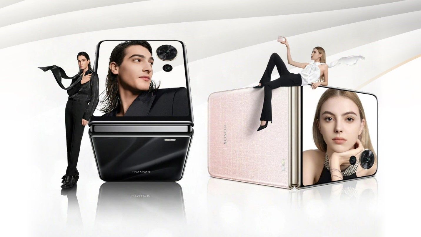
HONOR sets the stage for a new Magic to flip the crowd

Published Jun 13, 2024 02:23 am  |  Updated Jun 13, 2024 02:23 am

image (19).png

HONOR has started teasing about the new Magic V Flip phone. It will first launch in China today. 

“We’re still waiting for updates regarding the availability of HONOR Magic V Flip and if it will come to the Philippines. This is exciting news for HONOR fans should we have a go signal. Therefore, stay tuned!” said Stephen Cheng, HONOR Philippines vice president.   
HONOR is boasting the massive cover screen and will be available in three colors.  

HONOR has yet to unveil the full official specs sheet yet. But given HONOR’s history of impressive devices, we wouldn’t be surprised if it’s anything but top tier.  

We’ll let you know more soon. 

ADVERTISEMENT
300x250
.most-popular .layout-ratio{ padding-bottom: 79.13%; } @media (min-width: 768px) and (max-width: 1024px) { .widget-title { font-size: 15px !important; } }

{{ articles_filter_1561_widget.title }}

.most-popular .layout-ratio{ padding-bottom: 79.13%; } @media (min-width: 768px) and (max-width: 1024px) { .widget-title { font-size: 15px !important; } }

{{ articles_filter_1562_widget.title }}

.most-popular .layout-ratio{ padding-bottom: 79.13%; } @media (min-width: 768px) and (max-width: 1024px) { .widget-title { font-size: 15px !important; } }

{{ articles_filter_1563_widget.title }}

{{ articles_filter_1564_widget.title }}

.mb-article-details { position: relative; } .mb-article-details .article-body-preview, .mb-article-details .article-body-summary{ font-size: 17px; line-height: 30px; font-family: "Libre Caslon Text", serif; color: #000; } .mb-article-details .article-body-preview iframe , .mb-article-details .article-body-summary iframe{ width: 100%; margin: auto; } .read-more-background { background: linear-gradient(180deg, color(display-p3 1.000 1.000 1.000 / 0) 13.75%, color(display-p3 1.000 1.000 1.000 / 0.8) 30.79%, color(display-p3 1.000 1.000 1.000) 72.5%); position: absolute; height: 200px; width: 100%; bottom: 0; display: flex; justify-content: center; align-items: center; padding: 0 72px 0 12px; } .read-more-background a{ color: #000; } .read-more-btn { padding: 17px 45px; font-family: Inter; font-weight: 700; font-size: 18px; line-height: 16px; text-align: center; vertical-align: middle; border: 1px solid black; background-color: white; } .hidden { display: none; }
function showArticleBody(button) { const article = button.closest("article"); const summary = article.querySelector(".article-body-summary"); const body = article.querySelector(".article-body-preview"); const readMoreSection = article.querySelector(".read-more-background"); // Hide summary and read-more section summary.style.display = "none"; readMoreSection.style.display = "none"; // Show the full article body body.classList.remove("hidden"); } document.addEventListener("DOMContentLoaded", () => { let loadCount = 0; // Track how many times articles are loaded const offset = [1, 2, 3, 4, 5, 6, 7, 8, 9, 10]; // The two offset values // changed to 10 from 1 , 2 const currentUrl = window.location.pathname.substring(1); let isLoading = false; // Prevent multiple calls if (!currentUrl) { console.log("Current URL is invalid."); return; } function isNearBottom() { return window.innerHeight + window.scrollY >= document.documentElement.scrollHeight - 100; } function onScroll() { if (isLoading) return; // Skip if already loading if (isNearBottom()) { if (loadCount >= offset.length) { console.log("Maximum load attempts reached."); window.removeEventListener("scroll", onScroll); return; } isLoading = true; // Set flag to prevent multiple calls const currentOffset = offset[loadCount]; window.loadMoreItems().then(() => { loadCount++; // Increment only after successful execution }).catch(error => { console.error("Error loading more items:", error); }).finally(() => { isLoading = false; // Reset flag after execution }); } } window.addEventListener("scroll", onScroll); }); // Mutation Observer for Newly Loaded Articles const observer = new MutationObserver(() => { const articles = document.querySelectorAll(".articles-observe"); if (articles.length > 0) { observeArticles(articles); } }); observer.observe(document.body, { childList: true, subtree: true }); // Intersection Observer for Updating URL function observeArticles(articles) { const intersectionObserver = new IntersectionObserver( (entries) => { entries.forEach((entry) => { if (entry.isIntersecting) { const newUrl = entry.target.getAttribute("data-url"); if (newUrl) { history.pushState(null, null, newUrl); } } }); }, { threshold: 0.1 } ); articles.forEach(article => intersectionObserver.observe(article)); }
.col-md-12.noPadding.col-xs-12:has(.mb-header-bottom) {padding: 0;} .bottom-footer {color: #fff;background-color: #2E3192;padding: 8px 0;} .bottom-footer .bottom-footer-menu {font-family: Inter;font-weight: 400;font-size: 12px;line-height: 16px;padding: 0px 10px !important;color: #fff !important;text-decoration: none; } .bottom-footer .container {display: flex;justify-content: space-between;align-items: center; } .bottom-footer p{font-family: "Inter";font-weight: 400;font-size: 12px;line-height: 16px;margin-bottom: 0;} .subscribe-button{position: absolute;bottom: 15%;right: 11%;} .subscribe-container {position: fixed;display: flex;align-items: center;background-color: white;height: 50px;border-radius: 50px;box-shadow: 1px 3px 8px 3px rgba(0, 0, 0, 0.2);width: 50px;overflow: hidden;transition: width 0.3s ease-in-out;text-decoration: none;white-space: nowrap; } .subscribe-icon {background-color: #2E3192;color: white;border-radius: 50%;width: 50px;height: 50px;display: flex;align-items: center;justify-content: center;font-size: 18px;flex-shrink: 0;transition: border-radius 0.3s ease-in-out; } .subscribe-text {font-size: 18px;font-weight: bold;color: black;margin-left: 0;margin-right: 0;width: 0;visibility: hidden;opacity: 0;transition: opacity 0.3s ease, width 0.3s ease;} .subscribe-container:hover {cursor: pointer;width: 170px;} .subscribe-container:hover .subscribe-icon {border-bottom-right-radius: 0;border-top-right-radius: 0;} .subscribe-container:hover .subscribe-text {visibility: visible;opacity: 1;margin-left: 10px;margin-right: 10px;width: auto;} h6.footer-heading{ font-weight: 700; } #bottom-footer ul li { display: flex; align-items: center; } @media screen and (min-width: 767px) and (max-width: 991px) { .bottom-footer p, .bottom-footer .bottom-footer-menu{ font-size: 9px; } } @media(max-width: 767px) { .bottom-footer .container {display: block;} .bottom-footer .container .justify-content-center{margin-top: 20px !important;} .bottom-footer .container .justify-content-center .list-group{ width: 100%; display: grid; row-gap: 10px; grid-template-columns: 1fr 1fr 1fr; justify-content: unset; } .bottom-footer p{font-size: 10px;} .subscribe-container { width: 50px !important; overflow: hidden;} .subscribe-container:hover { width: 50px !important;} .subscribe-container .subscribe-text {display: none !important;} .subscribe-button{right: 15%;bottom:7%;} } .mb-header-bottom .header-menu:hover { color: #2E3192 !important; } @media(max-width: 400px) { .bottom-footer .container .justify-content-center .list-group{ grid-template-columns: 1fr 1fr; } }

Sign up by email to receive news.