ADVERTISEMENT
970x220
.navbar-nav.header-menu { width: 100%; justify-content: center; } .tab-menu-outers .nav-item{ width: unset; } .tab-bar-social.mt-5 { margin-top: 0 !important; } .second-header-menu { margin-top: 27px; padding: 12px 0; border-top: 1px solid #C3C1AE; border-bottom: 1px solid #C3C1AE; } .third-header-menu{ padding: 12px 0; } .bottom-header-menu { margin-right: 25px; text-decoration: none; font-family: "Canicule Display v0.3 Trial" , serif; font-weight: 500; font-size: 15px; line-height: 16px; color: black; } .bottom-header-menu:hover { color: #0A58CA !important; } header .time-date-section { display: flex; align-items: end; } header .mb-header-center .align-items-center .col-3 , header .mb-header-center .align-items-center .col-6, header .top-header-container .col-md-6{ z-index: 100; } header .desktop-menu-bar li:hover a{ background: transparent; color: #2E3192 !important; } @media(max-width: 767px) { header.header.mb-header{ display:none; } .second-header-menu .justify-content-center{ justify-content: start !important; } .second-header-menu ul , .third-header-menu ul{ display: grid; grid-template-columns: 1fr 1fr; width: 100%; } }

Fans can send Playlist Letters to BTS’ RM on Spotify

Published May 17, 2024 14:15 pm  |  Updated May 17, 2024 14:15 pm

BTS member RM will be releasing his second solo album “Right Place, Wrong Person” on May 24. 

To celebrate the release, Spotify has opened its letter box to let fans send their heartfelt messages to RM–through Playlists. 
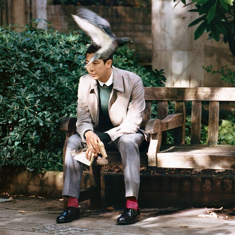
RM5.jpeg

BTS' RM (X)1. Spotify Playlist Letters to RM of BTS.jpg

2. Spotify Playlist Letters to RM of BTS.jpg

Ready with your message? Here’s how you can submit your Playlist Letter to RM:

 1. Create a new Spotify playlist and arrange your chosen songs to have their titles form your message.

 2. To send your Playlist Letter to RM, respond to this #SpotifyxRM tweet on @SpotifyKpop on X with a screenshot and link to your dedicated playlist.

 Show your love to RM and send your Playlist Letter now. 


Related Tags

Spotify BTS RM
ADVERTISEMENT
300x250
.most-popular .layout-ratio{ padding-bottom: 79.13%; } @media (min-width: 768px) and (max-width: 1024px) { .widget-title { font-size: 15px !important; } }

{{ articles_filter_1561_widget.title }}

.most-popular .layout-ratio{ padding-bottom: 79.13%; } @media (min-width: 768px) and (max-width: 1024px) { .widget-title { font-size: 15px !important; } }

{{ articles_filter_1562_widget.title }}

.most-popular .layout-ratio{ padding-bottom: 79.13%; } @media (min-width: 768px) and (max-width: 1024px) { .widget-title { font-size: 15px !important; } }

{{ articles_filter_1563_widget.title }}

{{ articles_filter_1564_widget.title }}

.mb-article-details { position: relative; } .mb-article-details .article-body-preview, .mb-article-details .article-body-summary{ font-size: 17px; line-height: 30px; font-family: "Libre Caslon Text", serif; color: #000; } .mb-article-details .article-body-preview iframe , .mb-article-details .article-body-summary iframe{ width: 100%; margin: auto; } .read-more-background { background: linear-gradient(180deg, color(display-p3 1.000 1.000 1.000 / 0) 13.75%, color(display-p3 1.000 1.000 1.000 / 0.8) 30.79%, color(display-p3 1.000 1.000 1.000) 72.5%); position: absolute; height: 200px; width: 100%; bottom: 0; display: flex; justify-content: center; align-items: center; padding: 0 72px 0 12px; } .read-more-background a{ color: #000; } .read-more-btn { padding: 17px 45px; font-family: Inter; font-weight: 700; font-size: 18px; line-height: 16px; text-align: center; vertical-align: middle; border: 1px solid black; background-color: white; } .hidden { display: none; }
function showArticleBody(button) { const article = button.closest("article"); const summary = article.querySelector(".article-body-summary"); const body = article.querySelector(".article-body-preview"); const readMoreSection = article.querySelector(".read-more-background"); // Hide summary and read-more section summary.style.display = "none"; readMoreSection.style.display = "none"; // Show the full article body body.classList.remove("hidden"); } document.addEventListener("DOMContentLoaded", () => { let loadCount = 0; // Track how many times articles are loaded const offset = [1, 2, 3, 4, 5, 6, 7, 8, 9, 10]; // The two offset values // changed to 10 from 1 , 2 const currentUrl = window.location.pathname.substring(1); let isLoading = false; // Prevent multiple calls if (!currentUrl) { console.log("Current URL is invalid."); return; } function isNearBottom() { return window.innerHeight + window.scrollY >= document.documentElement.scrollHeight - 100; } function onScroll() { if (isLoading) return; // Skip if already loading if (isNearBottom()) { if (loadCount >= offset.length) { console.log("Maximum load attempts reached."); window.removeEventListener("scroll", onScroll); return; } isLoading = true; // Set flag to prevent multiple calls const currentOffset = offset[loadCount]; window.loadMoreItems().then(() => { loadCount++; // Increment only after successful execution }).catch(error => { console.error("Error loading more items:", error); }).finally(() => { isLoading = false; // Reset flag after execution }); } } window.addEventListener("scroll", onScroll); }); // Mutation Observer for Newly Loaded Articles const observer = new MutationObserver(() => { const articles = document.querySelectorAll(".articles-observe"); if (articles.length > 0) { observeArticles(articles); } }); observer.observe(document.body, { childList: true, subtree: true }); // Intersection Observer for Updating URL function observeArticles(articles) { const intersectionObserver = new IntersectionObserver( (entries) => { entries.forEach((entry) => { if (entry.isIntersecting) { const newUrl = entry.target.getAttribute("data-url"); if (newUrl) { history.pushState(null, null, newUrl); } } }); }, { threshold: 0.1 } ); articles.forEach(article => intersectionObserver.observe(article)); }
.col-md-12.noPadding.col-xs-12:has(.mb-header-bottom) {padding: 0;} .bottom-footer {color: #fff;background-color: #2E3192;padding: 8px 0;} .bottom-footer .bottom-footer-menu {font-family: Inter;font-weight: 400;font-size: 12px;line-height: 16px;padding: 0px 10px !important;color: #fff !important;text-decoration: none; } .bottom-footer .container {display: flex;justify-content: space-between;align-items: center; } .bottom-footer p{font-family: "Inter";font-weight: 400;font-size: 12px;line-height: 16px;margin-bottom: 0;} .subscribe-button{position: absolute;bottom: 15%;right: 11%;} .subscribe-container {position: fixed;display: flex;align-items: center;background-color: white;height: 50px;border-radius: 50px;box-shadow: 1px 3px 8px 3px rgba(0, 0, 0, 0.2);width: 50px;overflow: hidden;transition: width 0.3s ease-in-out;text-decoration: none;white-space: nowrap; } .subscribe-icon {background-color: #2E3192;color: white;border-radius: 50%;width: 50px;height: 50px;display: flex;align-items: center;justify-content: center;font-size: 18px;flex-shrink: 0;transition: border-radius 0.3s ease-in-out; } .subscribe-text {font-size: 18px;font-weight: bold;color: black;margin-left: 0;margin-right: 0;width: 0;visibility: hidden;opacity: 0;transition: opacity 0.3s ease, width 0.3s ease;} .subscribe-container:hover {cursor: pointer;width: 170px;} .subscribe-container:hover .subscribe-icon {border-bottom-right-radius: 0;border-top-right-radius: 0;} .subscribe-container:hover .subscribe-text {visibility: visible;opacity: 1;margin-left: 10px;margin-right: 10px;width: auto;} h6.footer-heading{ font-weight: 700; } #bottom-footer ul li { display: flex; align-items: center; } @media screen and (min-width: 767px) and (max-width: 991px) { .bottom-footer p, .bottom-footer .bottom-footer-menu{ font-size: 9px; } } @media(max-width: 767px) { .bottom-footer .container {display: block;} .bottom-footer .container .justify-content-center{margin-top: 20px !important;} .bottom-footer .container .justify-content-center .list-group{ width: 100%; display: grid; row-gap: 10px; grid-template-columns: 1fr 1fr 1fr; justify-content: unset; } .bottom-footer p{font-size: 10px;} .subscribe-container { width: 50px !important; overflow: hidden;} .subscribe-container:hover { width: 50px !important;} .subscribe-container .subscribe-text {display: none !important;} .subscribe-button{right: 15%;bottom:7%;} } .mb-header-bottom .header-menu:hover { color: #2E3192 !important; } @media(max-width: 400px) { .bottom-footer .container .justify-content-center .list-group{ grid-template-columns: 1fr 1fr; } }

Sign up by email to receive news.