On second chances this construction season
Transforming a worn-out, uninspiring space into a cutting-edge interior full of life and dynamic youthful energy
For most people, summer is the time to take a break from the city's unbearable heat and go on vacation. However, for the construction industry, it's actually the peak of building and renovation works.
As an interior designer, renovating run-down properties is something I usually don’t look forward to. I would rather work on interior design for a newly constructed building space or a ground-up project, literally starting from scratch. As we say in construction, it’s easier to build your own from nothing than to work on an old and existing structure, not knowing its past issues, especially in electrical, plumbing, and structural stability.
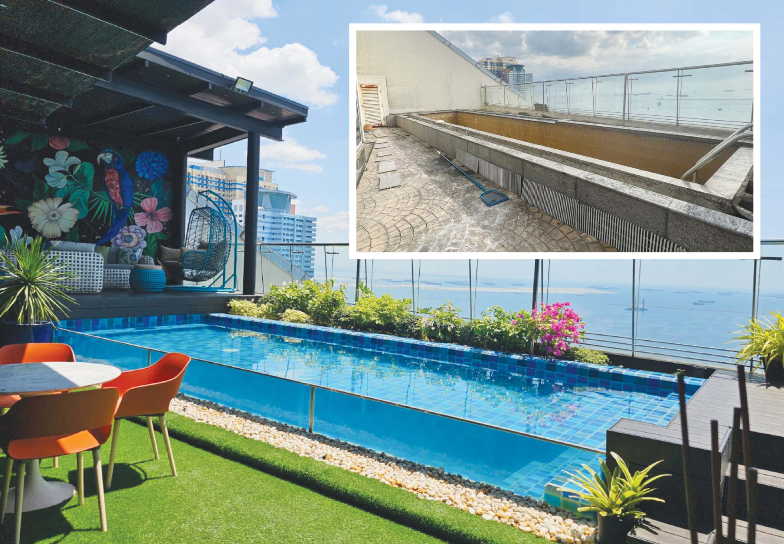
Since I’m always up for a challenge, my team at Empire Designs and I recently took on an abandoned penthouse property renovation project in Manila overlooking Manila Bay. It wasn’t love at first sight when I stepped through its doors. But upon walking onto the balcony and pool deck, the unobstructed view of Manila Bay was so captivating that I became even more excited to work on the project, together with our contractor, Dicept Builders.
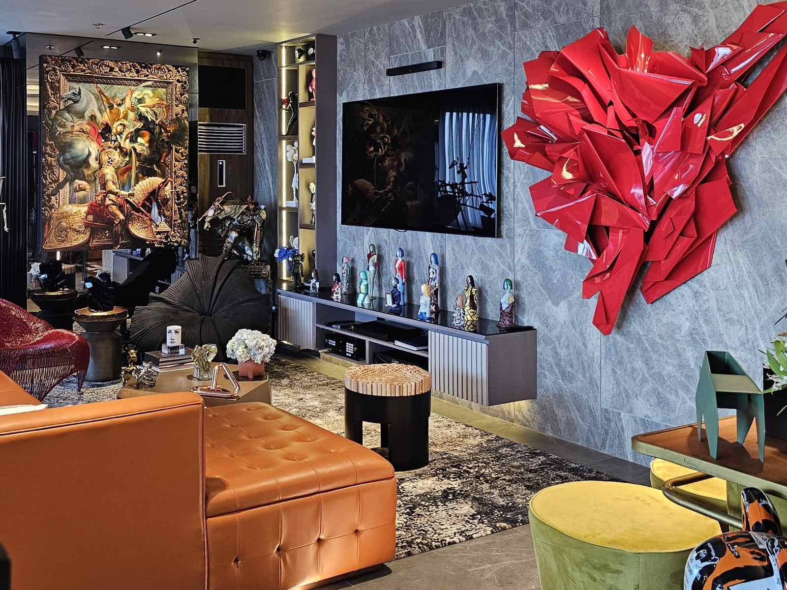
Another aspect of the project that thrilled me was the client’s expansive collection of art and furniture, ranging from different styles and media, from intricate miniatures to huge paintings and life-size sculptures. Luckily, it was easy to collaborate with the client, who simply trusted us with the design and concept of the unit. Overall, we aimed to transform a worn-out, uninspiring space into a cutting-edge interior full of life and dynamic youthful energy.
One important tip in renovation work is to begin by detecting key existing architectural and structural features of the space, enhancing them with elements to achieve the purpose and desired look of the design intent. Flaws and limitations become opportunities to discover new perspectives and values.
In our case, it was the glass windows and doors, the columns, very few walls, the beams, and the low ceiling height of the whole unit that gave us a blank canvas for an unconventional creative output. For the foyer, we played with materials and patterns to create a bold impact upon entry. We clad our main wall with croc-stamped leather and brass metal inserts and concealed the doors to the bedrooms with wooden fluted panels, creating a worthy backdrop to showcase selected examples from the client’s collection.
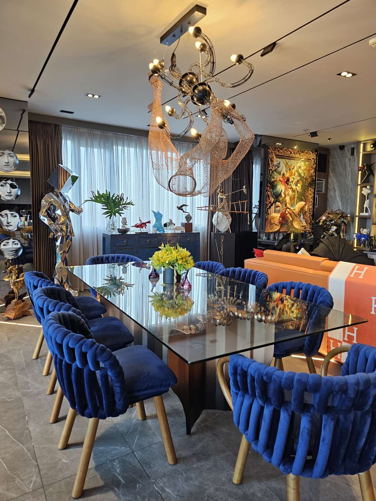
In the living and dining rooms, we covered the columns with gray mirrors to hang artworks and utilized niches to conceal the floor-mounted air-conditioning units and surround speakers. We kept the ceiling flat, painted in a muted grey color, and incorporated modern linear lighting from the floor up to the walls and ceiling.
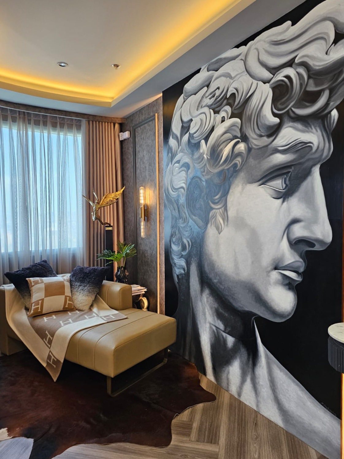
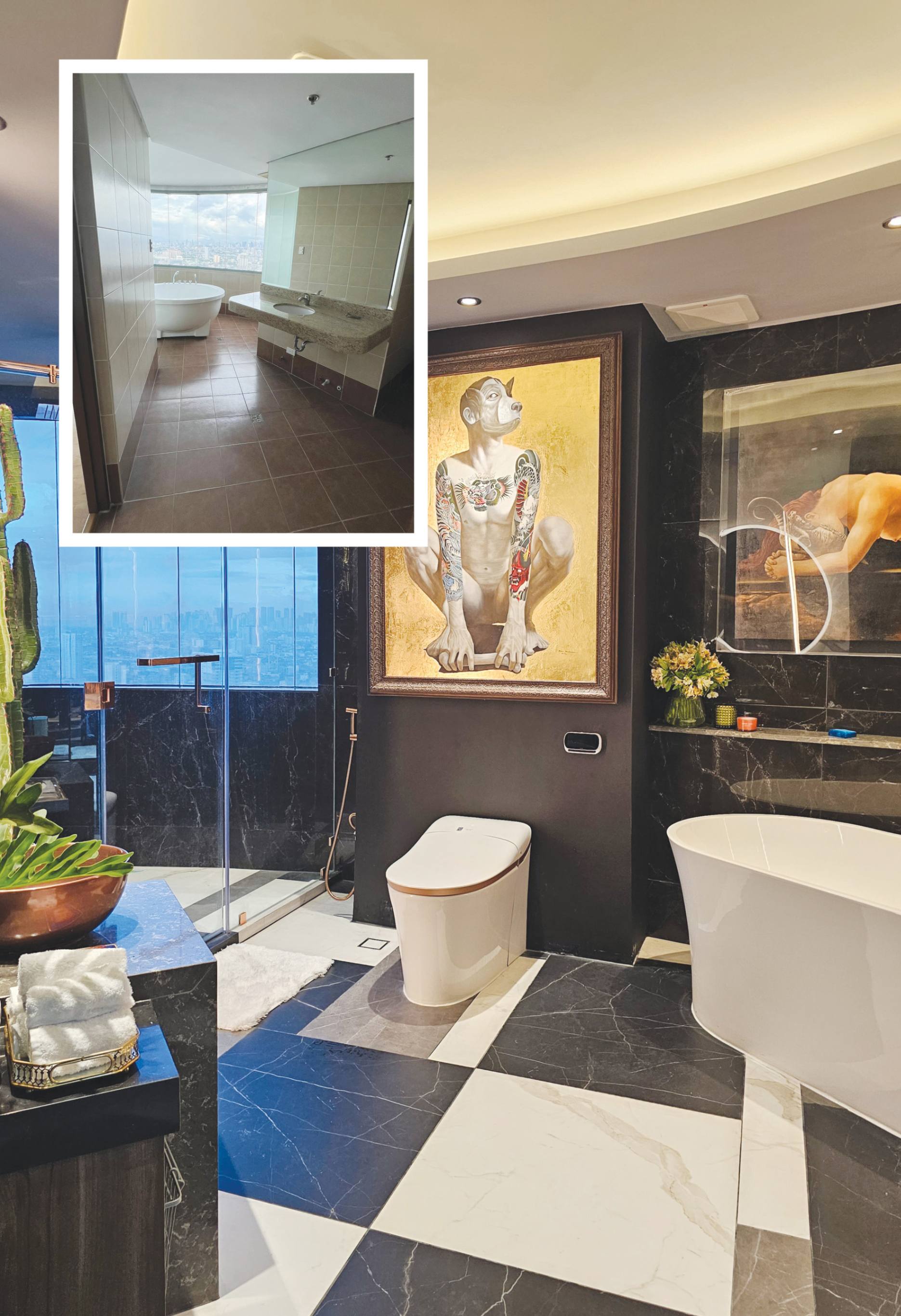
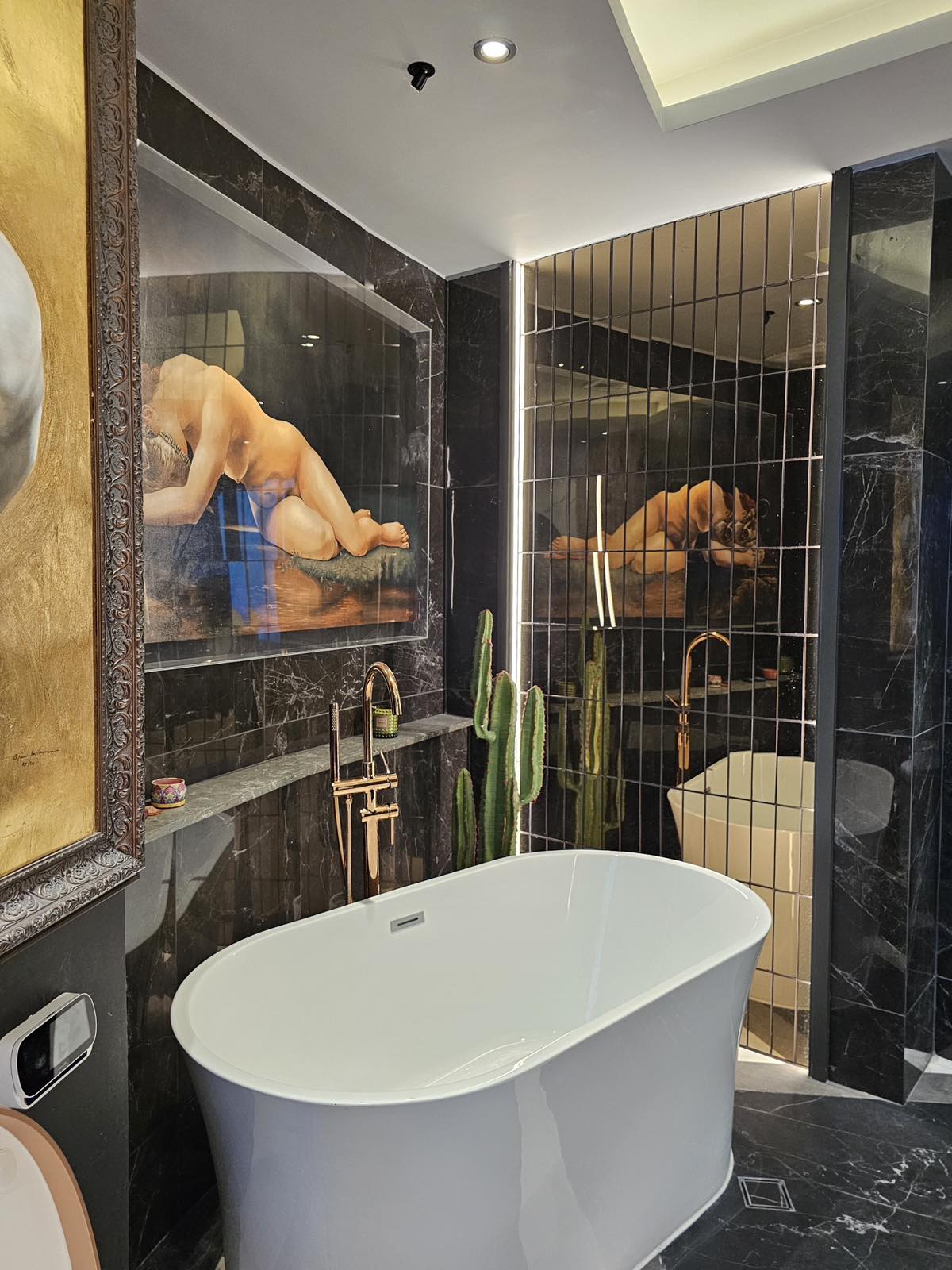
Our master bedroom boasts curved windows with spectacular views of Intramuros and the National Museum from its bathroom. For the corner wall of the lounge area, we commissioned artist Marco Banares to create a six-day hand-painted headshot wall mural of David. This is the main piece of art inside the bedroom. The bathroom showcases more impressive examples from the client’s art collection, accentuated by our choice of neutral tile colors and patterns, as well as lustrous rose gold metal and bronze mirror elements.
Another saying in the construction industry is that nothing comes easy. So, while renovation projects are typically more demanding, there are moments that make the challenges worth it. Renovations teach us that giving an old space a second chance at life holds a much deeper prize and story to tell.