


PH 2022 election results analysis using Newcomb-Benford's Law
By Wilson Chua


How do accountants (Like Me) quickly detect the presence of fudged data in financial reports? We use a little known technic called the Newcomb-Benford’s law to efficiently and quickly analyze a set of numbers. FYI:
https://en.wikipedia.org/wiki/Benford%27s_law
How does this law work? We take the leftmost digits of all the numbers in any report and tabulate the frequency each LEFTMOST digit (from 1 to 9) comes up. We then look at the distribution/histogram. A normal data distribution would look like this:

This means that a normal set of numbers would see around 30% of all the numbers to start with ‘1’. The ‘2’ will have an expected distribution of 17.6% and so on.
TEST Data Anaylsis
First I show what Benford Distribution would look like in a known false/fudged/faked data. For this I use the TEST dataset from Comelec’s transparency server.
I followed the steps outlined here:
https://help.tableau.com/current/pro/desktop/en-us/benford.htm for the steps to visualizing a Benford’s Law algorithm in Tableau.
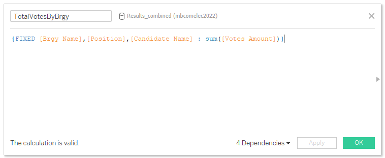
I connect to the TEST data in Google Big Query and generate totals at the Barangay levels. I limit the table to only the test results for PRESIDENTIAL candidates.
Note: Benford algorithm works best when the data is large and widely distributed. This is NOT the case if I use the tabulated results at the precinct or VCM levels. Neither would it work at the Regional, Provincial or Municipal levels, as the resulting aggregated numbers would be too small for Benford to work.
I create a calculated field named “TotalVotesByBrgy” (and for President) using LOD (level of detail) set to the Barangay levels.
We now create two more calculated fields:

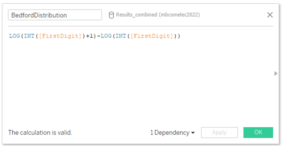
This extracts the LEFTMOST digit of each of the barangay level tallies for each candidate. And then another calculated field to hold the log of the bedfords Law:
Set up the view
From the Data pane, drag FirstDigit to Columns, and then drag to Rows.
Click sum([TotalVotesByBrgy) on Rows and choose Quick Table Calculation > Percent of Total. I drag this sum([TotalVotesByBrgy) to the Text Label marks.
Your view now shows the distribution of first digits, and the size of the bars (decreasing from left to right) suggests that the data in this case conforms to Benford’s law.
But we can do more to frame the data by adding reference distributions.
- From the Data pane, drag BenfordDistribution to Detail on the Marks card. Click BenfordDistribution on the Marks card and select Measure > Minimum.
- Switch from the Data pane to the Analytics pane and drag Distribution Band into the view. Drop it on Cell.

In the Percentages area, type 80,100,120.

This specifies that you want bands spanning from 80 to 100 percent, and from 100 to 120 percent. Next you will specify what value the percentages are referencing.
- Set Label to None.
- Set Line to the thinnest available line.
- Choose Fill Below.
- From Fill, select Stoplight.
- Click OK to exit the Edit Reference Line, Band, or Box dialog box.

We see that most of the leftmost digits did not conform to the expected Benford’s Law distribution. The distribution should be at or near the yellow bands. These yellow bands represent 80–100% of expected distribution. This is what a faked data/fudged/manipulated data would look like.
Actual PH 2022 Election Results
Next we analyze the ACTUAL election results from the Comelec Transparency server data (May 11, 2:17pm). This was supplied to Manila Bulletin. And using the same process outlined above, this is the resulting distribution:
Benford Plot for Presidential Votes:


The overall charts conforms to the expected patterns predicted by Benford’s Law algorithm. So I see no red flags that might indicate manipulation. However, as I am hoping my peers can chime in with their ideas and help peer review this as well.